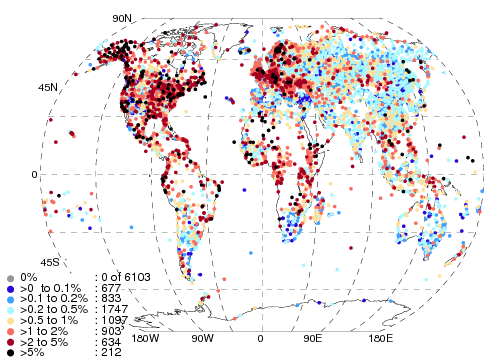
Monday, 9 June 2014

Cows, Milk and Heat Stress

We've just had a paper published in ERL on heat stress in UK dairy cattle and the effect this has on milk yields.  This was initially a short piece of work which at the time was the first application of HadISD to a specific project.  However the project grew and took longer than anticipated, and hence has only been published now.

(UK) dairy cattle and heat stress


Many animals are affected by high temperatures and humidities.  Think about a hot, humid day, personally I wouldn't have much energy and would prefer just lazing in the shade of a tree.  If, for example, I went for a run, I would get pretty warm, which may cause heat-stroke if I went for too long.  And if it is humid overnight, I don't sleep as well as normal either, which puts my body under more stress.  Cattle aren't often seen going for runs, but if they cannot cool themselves, they also get heat-stressed.  This means they divert energy from growing and producing milk to cooling down, and so you can measure the effect of the warm temperatures in the milk yields, which is handy as asking them how they feel is tricky!

We used a measure for heat stress called the "Temperature-Humidity Index" (THI) which combines the air temperature and the relative humidity.  Both of these are available from data in 68 of the HadISD stations used in this study.  When the THI rises above 70, then cattle experience heat-stress, and if it rises over ~90, then the heat stress is very severe and could be fatal.  We looked at the daily average THI, and across the UK, for most of the stations, this threshold of THI > 70 is only crossed in one or two days per year (Fig. 1).

Fig 1.  Top: The average number of days (over 1973-2012) with THI > 70 for the 68 UK stations.  Bottom: The number of days with THI > 70 in 2003.  Stations with no days where THI > 70 are shown with grey squares.  Note change in colour scale between the two panels.
The stations inside the M25 (the motorway around London) have more days, but we suspect that there are few cattle being raised that close to London.  Looking at the years of 2003 and 2006, which had very warm summers, there were 5-10 days where cattle could be heat-stressed (Fig. 1).  Using data provided by the Cattle Information Service we were able to look at data for milk yields on an animal-by-animal basis for a number of herds in the areas most likely to have been strongly affected by the high temperatures.

Factors affecting Milk Yields

There are a number of complicating factors when looking at milk yields from dairy cattle.  The amount of milk a cow produces depends on both the number of calves she has had, and also the number of days that have elapsed since her most recent calf was born (Fig 2.) 

Fig.2 Top: Yield vs days in milk, Bottom: Yield vs lactation number for herd 198 in Devon.  Blue points show individual measurements and the red ones show the average (over a 10 day bin or lactation number) with a 1-sigma uncertainty.


By looking at data on an animal-by-animal basis we were able to select cows in their first lactation and use ranges of 50 days since the birth of their calf to try and reduce the variation from these additional effects.  Fig. 3 shows the change in the milk yields for one herd over the entire record.  There is a clear decline in milk yields in 2006 for all ranges of days-in-milk.  The yield drops from 30 litres to between 15 and 20 litres.  There are few cattle contributing prior to 2004, resulting in a noisy curve and no clear indication of an effect in 2003.  Combined with the effect of heat-stress is also the reduction in pasture quality for grass fed cattle as the fields tend to dry out during hot weather.  However the feed information was not available

Fig. 3 Milk yields for one-calf cows in herd 4199 in Somerset.  The bands are the 1-sigma ranges for the three ranges of days-in-milk.  The dashed lines show the numbers of cows contributing to the mean milk yields.  The magenta line shows the Somerset average monthly temperature (Perry & Hollis, 2005).  The vertical dashed lines show the heatwaves of 2003 and 2006.

Climate Projections from UKCP09 

To study the effect of any future change in the climate on the number of days with high THI we used the projections from the UK Climate Prediction '09 assessment (UKCP09, Murphy et al 2009).  This is an 11-member ensemble of regional climate models runs on a 25 x 25 km grid.  The future climate is driven by a medium emissions scenario (A1B).  Fig. 4 shows the number of days in each grid box where the THI>70 for the south-west region.  Currently, as per the observations, there are only a few days on average where the threshold is exceeded.  But by the end of the century, this could have risen to around 30 days per year.
Fig. 4. The number of days per grid box where the THI > 70, averaged over the south-west region.  Each of the 11 ensemble members are shown in the grey lines, with the median and interquartile range being given by the thick black line and blue envelope respectively.

This could have a large effect on the milk yields produced by cows, and so impact on the viability of herds and dairy farming in parts of the UK.  Although keeping cattle indoors can mitigate the effect of direct solar radiation, the humidity in barns has been found to be always higher than indoors (Erbez et al, 2010).  Thought will have to be given in the future how best to keep cattle for their well being and also to ensure that dairy farming remains viable in parts of the UK.

References


Erbez M, Falta D and Chládek G 2010 The relationship between temperature and humidity outside and inside the permanently open-sided cows’ barn Acta Universitatis Agriculturae et Siliviculturae Mendelianae Brunensis (Brno, Česká Republika), LVIII 91–6
 
Murphy J M et al 2009 UK Climate Projections Science Report: Climate Change Projections Met Office Hadley Centre, Exeter, UK


Tuesday, 29 April 2014

HadISD v1.0.2.2013f released

The latest version of HadISD has been made available on the hadobs website.  This version (v1.0.2.2013f) supercedes the preliminary version from earlier this year (v1.0.2.2013p).  There were further updates to the ISD source data for the year 2013 since the preliminary dataset was created in January, but no changes in earlier years.

Extra variables have been pulled through from the ISD source data in this release, but these have not been quality controlled.  They are wind gust and precipitation period.  As these were not quality controlled there has been no further increment of the version number.  If you use these variables then be aware that they are provided as is, with no guarantee as to their quality.

As always, if you find anything untoward in the data, please contact the dataset maintainers.

Monday, 14 April 2014

First steps in homogenising HadISD

Having done the second annual update to HadISD in January this year (to version 1.0.2.2013p), we have started the process of homogenising the dataset.  The issue of homogenising hourly data (applying the adjustments to the data) is something that has not yet been fully solved.  Monthly homogenisation has been used for a while now, and there has been at least one benchmarking study to assess the accuracy and precision of the different available algorithms (Venema et al 2012).  Solving the problem of daily homogenisation has been started by some groups, but my impression is that these have been for small, regional networks of stations and also involved a relatively large amount of manual intervention.  I am open to suggestions of algorithms and studies that I have missed.

In the light of these issues, rather than trying to solve the problem of automated, hourly homogenisation in one step, we shall start by releasing the homogeneous sub-periods for each station in the dataset.  However this means that the users will need to decide what to do with this information.  For example, each sub-period could be treated separately or stations with few/small breaks could be given a greater weighting than those with many/large breaks in any analysis.

As HadISD contains 6103 stations, we have had to use methods and scripts which allow for a completely automated system.  This has the advantage that the results are completely reproducible and objective, even if a system which includes some manual checking might be better in some situations. 

We have chosen to use the Pairwise Homogenisation Algorithm (PHA) used for the US Historical Climate Network (USHCN) by Menne & Williams (2009).  Kate Willett has already used this for her HadISDH dataset (Willett et al. 2012) and is using it for the extension to other humidity variables (for more details see http://hadisdh.blogspot.co.uk).  We could therefore be certain that this system would run on the data automatically and be quick enough to be of use.  Alternative systems were considered (e.g. SPLIDHOM/HOMER, ACMANT, MASH) but none of these were suitable either because of the computer operating systems available or because of the level of manual intervention required.  This was a shame, as a comparison between two or more systems would have given some level of confidence on the breaks found.  Perhaps something for the future.

Networks and Averages


When starting the homogenisation process with PHA, we found that the results were sensitive to the station network used.  Small changes in the neighbour selection and also the individual monthly values would mean that change points were or were not found in target stations.  Hence we initially decided to use four different networks, comprising of stations with more than 30, 20, 10 and zero years of data (the final network contains all 6103 stations). PHA was run using each of these networks separately.

Initially only monthly average data were used, calculated from daily averages.  These are calculated for all days which have more than four observations spread over at least a 12 hour time-span.  Monthly means were calculated for all months with at least 20 qualifying days.  However, Wijngaard et al. (2003) showed that change points were clearer when using the monthly average diurnal temperature range.  Also, monthly average maximum and minimum temperatures were used by Trewin (2013) when homogenising the Australian Climate Observations Reference Network - Surface Air Temperature (ACORN-SAT).  Using these measures could identify change points where the maximum or minimum temperatures change but the means remain unchanged.

We initially tried to use all four different measures (mean, diurnal range, maxima and minima) as well as the four different network types, resulting in 16 PHA runs for each variable (temperature, dewpoint temperature, sea-level pressure and wind speeds).  Change points were merged if they occurred within one year of one another, and the average date was used.  The final set of change points were those which were identified in at least two of the 16 methods.

Although using all these methods and networks may compensate for the conservative nature of PHA (Venema et al. 2012), this approach was biased to selecting change points in stations with longer records.  If a change point is detected 50% of the time by any of the PHA runs, then it is likely to appear 8 times overall for a station with a long record, but only once for a station with a short record, and hence fail to meet the selection criteria in the short station, but be selected in the longer station.

We therefore reduced the complexity to use only the complete network of 6103 stations, and only the mean and diurnal range (temperature and dewpoint), mean and maximum (wind speeds) or mean only (SLP).  If change points were within one year of one another, they were merged.  Naturally this reduced the number of change points detected.  However, despite not applying adjustments to the data, we do not want to make the data worse.  This approach is less likely to include spurious change points in the final lists then if using the combination of all 16 methods. 

Final Methology


The most important change points are those with the largest adjustment values, which should be detected in this simpler analysis as well as in the more complex one.  The change points with the smallest adjustment values are difficult to detect using any of the methods, resulting in the characteristic "missing middle" when showing the distribution of adjustments (Fig. 1).  Assuming that the Gaussian envelope is an accurate representation of all adjustments in HadISD, then PHA has identified most down to a limit of around 0.5C, with no strong bias in the distribution.
Fig. 1 Distribution of adjustment sizes for the monthly average temperatures.  The raw adjustments are shown in black, with a fitted Gaussian in red.  The difference between this Gaussian and the detected adjustments is shown by the blue histogram.

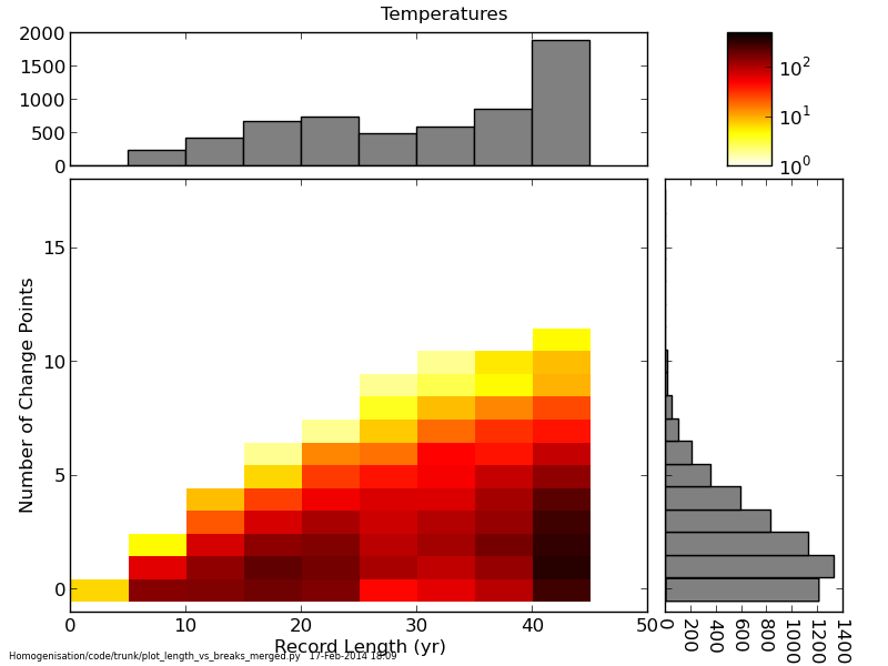
Unsurprisingly, the longer the station record, the more change points are detected, with on average 2.8 per station over 41 years (roughly one every 15 years), but four stations have 11 change points (Fig. 2). 


Fig. 2. The distribution of the number of change points with the length of the station record.
In due course, the change point dates and adjustment sizes (which have not been applied to the data) will be made available on the HadISD website.

The paper describing the final methodology in detail, and also the characteristics of the change points in the dewpoint temperature, sea-level pressure and wind speed observations is now under open review with Climate of the Past: http://www.clim-past-discuss.net/10/1567/2014/cpd-10-1567-2014.html

References

Menne, Matthew J., and Claude N. Williams Jr. "Homogenization of temperature series via pairwise comparisons." Journal of Climate 22.7 (2009): 1700-1717.

Trewin, B.: A daily homogenized temperature data set for Australia, International Journal of Climatology, 33, 1510–1529, 2013.
Venema, V., Mestre, O., Aguilar, E., Auer, I., Guijarro, J. A., Domonkos, P., Vertacnik, G., Szentimrey, T., Stepanek, P., Zahradnicek, P., et al.: Benchmarking homogenization algorithms for monthly data, Climate of the Past, 8, 89–115, 2012.

Wijngaard, J., Klein Tank, A., and Koennen, G.: Homogeneity of 20th century European daily temperature and precipitation series, International Journal of Climatology, 23, 679–692, 2003.

Willett, Kate M., et al. "HadISDH: an updateable land surface specific humidity product for climate monitoring." Climate of the Past 9.2 (2013): 657-677.

Monday, 7 April 2014

Low windspeeds in Irish stations

Thanks to Clive Wilson (Met Office) for informing us that the wind speeds in the Irish stations between July 1996 and August 1998 are lower than the surrounding years.  An example is shown in Fig 1. for Dublin.


Fig. 1 - Wind speeds for Dublin (039650-99999).  The vertical lines are change points detected on a monthly basis using the PHA algorithm of Menne & Williams (2009).  There is a change in resolution in the middle of 1998 coinciding with the change point.


Of the 14 Irish stations in HadISD, 12 have continuous data across this period (039520-99999 Roches Point and 039700-99999 Claremorris have no or sporadic data only across this period).  Most of the periods are identified using the PHA homogenisation algorithm that we are in the process of applying to HadISD.  

The affected stations are:

039530 99999 VALENTIA OBSERVATORY
039550 99999 CORK AIRPORT
039570 99999 ROSSLARE
039600 99999 KILKENNY
039620 99999 SHANNON AIRPORT
039650 99999 BIRR

039670 99999 CASEMENT AERODROME
039690 99999 DUBLIN AIRPORT
039710 99999 MULLINGAR
039740 99999 CLONES
039760 99999 BELMULLET
039800 99999 MALIN HEAD 


For the moment we advise users of HadISD to be cautious when using wind speed data for these stations over this period.  We are investigating the cause of this low period with the maintainers of the ISD at NCDC and will update this post when we have more information.

Monday, 27 January 2014

v1.0.2.2013p

We are in the process of finalising the update to HadISD version 1.0.2.2013p.  All plots and files should appear on the website later this week. This update extends the coverage of the dataset to the end of 2013 (31 December at 2300 inclusive).  It remains a preliminary dataset as there could still be further updates to the ISD dataset in the next few months.  We hope to do a processing run for the final version some time around Easter (to create 1.0.2.2013f).

We decided not to run an update last year (to what would have been v1.0.1.2012f) as the maintainers of the ISD were doing some large updates to the raw files.  It would only make sense to do the update once the ISD was stable, which would have meant our update being released towards the end of the year.  However, we hope that this year we can stick to our planned update cycle.

The raw data were downloaded on 14th January 2014, and processed over the subsequent week.  There have been changes to all of the raw files in 2010, 2011 and 2012 as part of the ISD update process mentioned above.  We have made no substantial changes to the codes which do the conversion to NetCDF files or the Quality Control suite.  Hence the version number has only incremented by 0.0.1 and the year.

This version still contains 6103 stations, with 4071 passing the final filtering checks, down slightly from the 4206 in v1.0.1.2012p (see the HadISD paper Section 6).  The patterns of flagging are very similar to v1.0.1.2012p.  However if you find something strange, do let us know using the contact details on the HadISD website.  Please note the stations which are known to have issues, documented on this blog and on the website.

Percentage of data removed by the QC tests for Temperature in HadISD v1.0.2.2013p
Percentage of data removed by the QC tests for Dewpoint Temperature in HadISD v1.0.2.2013p

Percentage of data removed by the QC tests for SLP in HadISD v1.0.2.2013p.  SLP is not reported at all time stamps, and so with shorter records the amount removed can appear higher.


We hope do have time to do some more development work on HadISD during 2014 which will address these stations as well as other improvements we have in mind.  So, if there are any requests, do get in touch.

Thursday, 19 December 2013

Spurious Stations - bad mergers

While homogenising HadISD (v.1.0.1.2012p) we have come across a number of stations which are bad mergers or station moves.  These are the stations where the PHA algorithm of Menne & Williams (2009) found breaks of larger than 5 degrees in temperature.

026720-99999 KALMAR               +56.733 +016.300 +16m   Sweden
157250-99999 SNEJANKA /TOP/SOMME       +41.667 +024.683 +193m Bulgaria
700638-99999 FALSE  PASS       +54.850 -163.417 +6m  US/Alaska
710620-99999 VIOLET GROVE  +53.000 -115.117 +903m Canada

710730-99999 QUEENTOWN     +50.600 -112.800 +941m Canada
715500-99999 DAUPHIN CS       +51.100 -100.050 +305m Canada
718260-99999 PANGNIRTUNG   +66.150 -065.717 +23m Canada
718360-99999 MOOSONEE        +51.283 -080.600 +9m Canada
719040-99999 WIMBORBE        +51.933 -113.583 +940m Canada
726626-99999 LANGLADE         +45.150 -089.117 +464m US/Wisconsin
729595-99999 TUKTOYAKTUK  +69.433 -133.033 +1m Canada


For station 719040, we suspect a typographical error in the ISD listing file as Wimborne is the name in the Environment Canada listing


In some cases we can determine the likely cause of the inhomogeneity.

Kalmar, False Pass, Dauphin, Moosonee, Tuktoyaktuk are all likely to have been erroneous merges carried out when creating HadISD.


The station number of Violet Grove (Alberta) has been reused by Environment Canada.  The station number used to belong to Bernard Harbour (Nunavut, 68.8, -114.8).  

The station number of Queenstown (Alberta) has also been reused by Environment Canada.  The station number used to belong to Cluff Lake (Saskatchewan between 1999 and 2005 and Fort Reliance (Northwest Territories) until 1994.

The station number of Pangnirtung (Nunavut) has also been reused by Environment Canada.  The station number used to belong to Nitchequon (Quebec) until 1985.

The station number of Wimborne (Alberta) has also been reused by Environment Canada.  The station number used to belong to Quaqtaq (Quebec) until 1989.

For Snejanka and Langlade have not been merged when creating HadISD, and therefore we are not sure why the large inhomogeneities have occurred.

Please be careful when using these stations.

The merging process of HadISD will be addressed and updated in the near future, and include all information on station moves that we have available.


026720-99999, Kalmar
157250-99999, Snejanka

700638-99999, Falls Pass

710620-99999, Violet Grove
710730-99999, Queenstown

715500-99999, Dauphin
718260-99999, Pangnirtung

718630-99999, Moosonee

719040-99999, Wimborne

726626-99999, Langlade

729595-99999, Tuktoyaktuk


Thursday, 3 October 2013

Heat-waves, time-series and Voronoi tiling

I'm currently working on using HadISD to study some heat-waves (mainly ones which have been studied in detail before).  A number of options present themselves when studying heat-waves, and Sarah Perkins (UNSW) has done some assessments on the best types of indices to use for heat-wave studies (2012, J. Climate, 26, 4500–451).  For the moment, however, I've stuck with something I've used before when assessing the performance of HadISD, and also something new to show spatial extents.

Time Series


To study the effect at an individual station what we can do with the HadISD data is to show the time-series from a particular year against the range expected from a climatology period.  As HadISD covers the span 1973-2012 (for v1.0.1.2012p), we have used the 30 year period of 1975-2004. 
Fig. 1. The daily temperatures from 2010 (green) shown on the 5th - 95th percentile range derived from the 30 year climatology over 1975-2004 (yellow band) for Moscow Botanical Gardens.

Fig. 1 shows the daily temperature for 2010 for the station in the Moscow Botanical Gardens (276120-99999, 55.833N, 37.617E).  To create the daily temperature we have required that there are at least 4 observations in a day (24hrs) and that these are spread over at least 12 hours.  For a climatology to be calculated, we require that valid days be present over at least 20 years in the 30 year period.  We also show the 5th - 95th percentile range in the yellow band, and have highlighted the days where the daily average temperatures are above the 95th percentile in red, and below the 5th percentile in blue.

The extreme warm period in late July and early August is clearly visible, and gives some impression as to the intensity and duration of the heat wave at this one station.  The magnitude of this event becomes clearer if we show the same plot for Paris-Montsouris (071560-99999, 48.817N, 2.333E) in 2003, Fig. 2.
Fig. 2. The daily temperatures from 2003 (green) shown on the 5th - 95th percentile range derived from the 30 year climatology over 1975-2004 (yellow band) for Paris-Montsouris

Spatial Extent & Voronoi Tiling

However, what about showing the spatial extent of a heat-wave.  With station data, we can show the value for each station as a coloured dot.  This isn't the clearest way of presenting the data, as is hopefully obvious in Fig. 3. 

Fig. 3 The 2010 Moscow heat-wave in HadISD for July.  Each station has been coloured by the number of degree days over climatology (see text for details)
What is plotted in Fig. 3 is basically the integral of the area highlighted in red in Fig. 1 & 2.  It is the sum over one month within a given year (July 2010 in this case) of the number of degrees the daily average is above the 95th percentile of the climatology (1975-2004 as above).   We are not counting the periods where the daily average is below the 5th percentile in the sum.  This measure gives an indication of the combined duration and intensity of an event.  A long event of only a few degrees above the 95th percentile would give the same signal of a short event which is many degrees above.  A few "bulls-eye" stations do stand out, which have high values but are not close to the centre of the heat-wave.

To try and improve the presentation of this heat map I played around with something called Voronoi tessellation (also known as Theissen Polygons).  This technique divides up an area on which a number of fixed points such that each edge of a polygon bisects the distance between two centres.  This is hopefully clear in the example below, which just colours each polygon by random, but also shows the lines which are bisected in red.
Fig. 4 Voronoi tiling.  The red lines show the connections between all the points, forming a set of Delaunay Triangles.  The Voronoi polygons are formed by joining all the bisectors of the edges of the triangles.
Combining the Voronoi method with the HadISD station distribution and the heat-wave index outlined above, results in the following map, also for July 2010.
Fig. 5 The heat map for Moscow in July 2010 using the Voronoi tiling method.  The location of each station is shown by a grey dot, usually close to the middle of the polygon, but not always so.
Using this method, the intensity of the heat-wave is much clearer than Fig. 3.  The few stations which for some reason have high values but are not in the heat-wave region (e.g. south Ukraine and central Turkey) stand out just as much as in Fig. 3.  By the nature of the tiling method, it is assumed that a station is representative of the area surrounding it.  Many stations are on the coast (UK, Norway etc.) and these are not clearly visible in Fig. 3, however the areas they represent are very clear in this representation.


An alternative way of presenting this kind of data would have been to grid up the individual stations into grid boxes.  Although this would have shown a very similar pattern, it would not be immediately clear from the resulting map, how many stations were contributing to a grid box.  Some gridding methods do not require any stations within the grid box, but use a weighted average of those stations within a search radius. The gridding process also would act as a smoothing function on the data, reducing the intensity of the maxima and minima.

Personally I think this is a good way of presenting the station data of HadISD in a space filling way without resorting to gridding.